Designs Re-imagined
CVS Packaging
I moved the word “chewable” from the top of the packaging because it may give someone the wrong impression on what CVS is trying to advertise. I put it in an area where it does not suggest that the contents of the packing contains chewable hair, skin and nails.


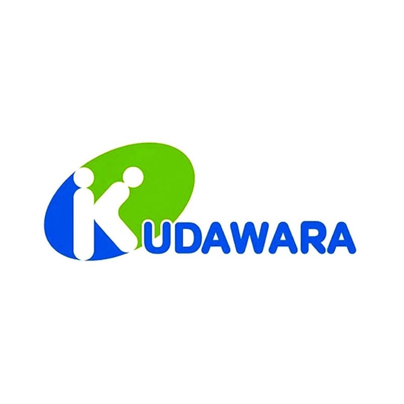
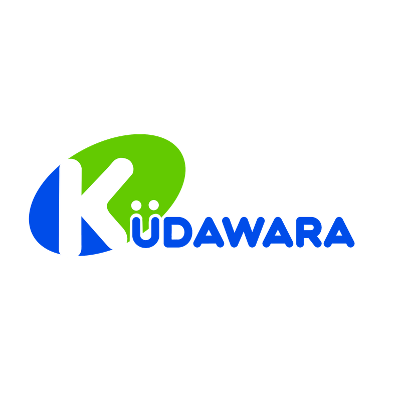
Kudawara Logo
I re-positioned the dots because it made the “k” look awkward. I moved them over the “u” in order to eliminate the assumption the mind may make when first glancing at the logo.
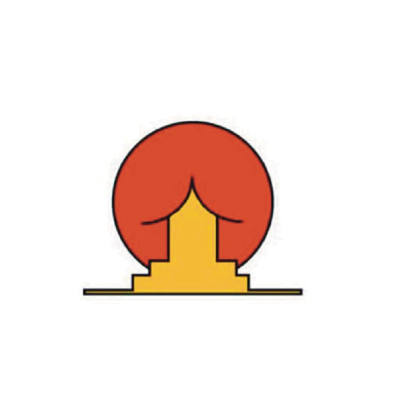
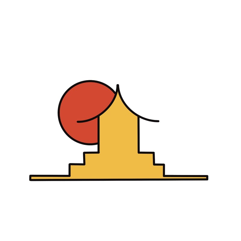
Institute of Oriental Studies Logo
The original logo creates another image in the viewers mind that does not accomplish what the designer was going for (or maybe it did). I simple moved the sun off center, to the left and made it smaller to separate the images.
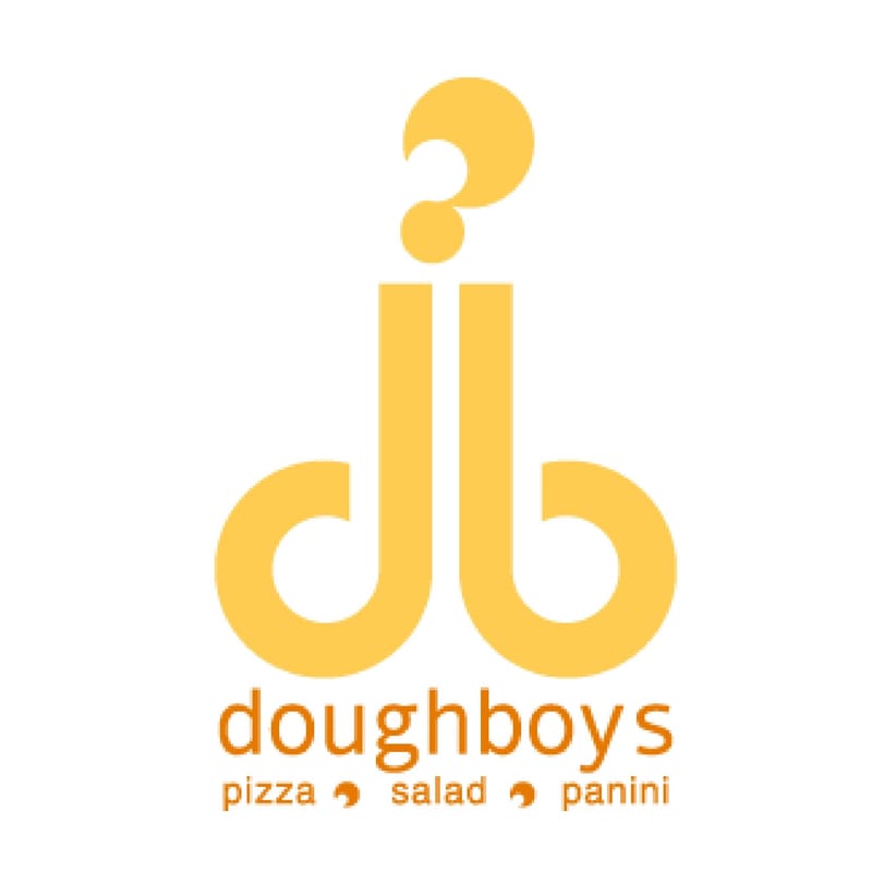
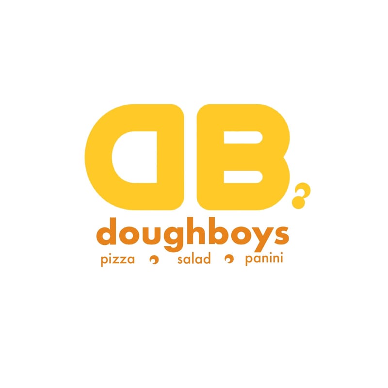
Doughboys Logo
This is another logo that has a suggestive image within it. I improved this logo by changing the “db” to capital letters and moving the symbol next to the be instead of above it.
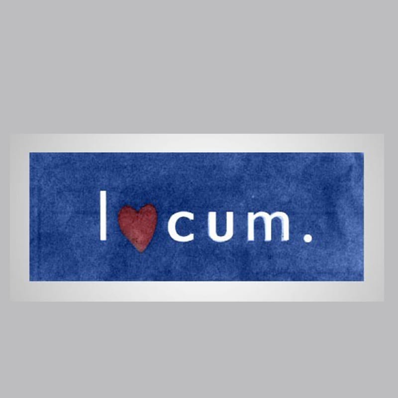
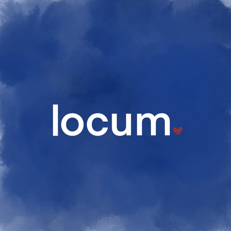
Locum
This design has a suggestive phrase. The designer tried making the heart replace the “o” but it just spelled something totally different. I used the heart as a period instead.
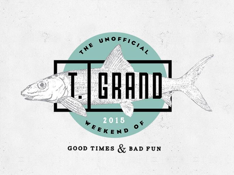
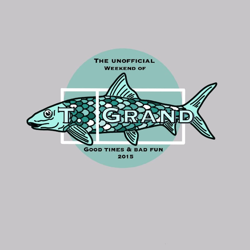
T. Grand Design
The first design was good, but it looked like there were multiple designs put together. In my version, I made all the line work the same style, simplified the fish, and made all the font the same type.